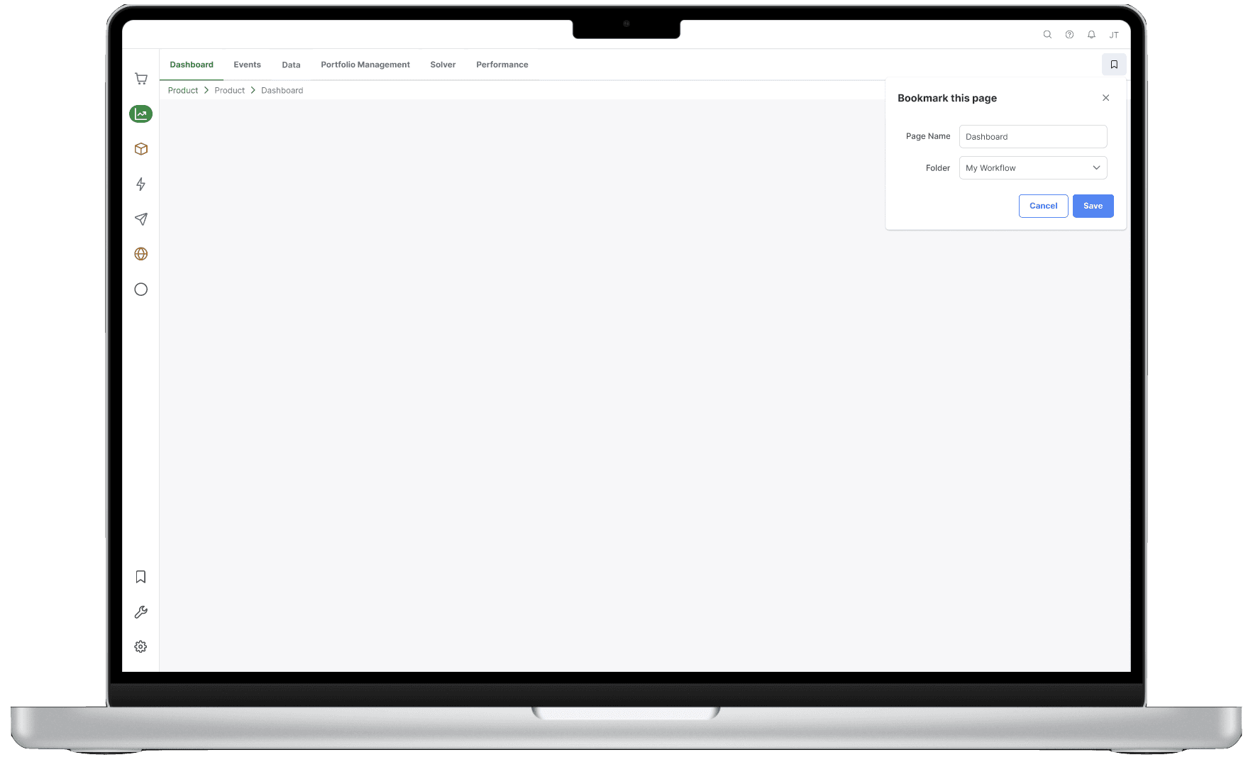
Updating the platform to the design system, improving the platform & product information architecture, and introducing the bookmark feature.
Starting with stakeholder insights and existing research, I identified key pain points. Collaborating with internal teams, I bridged gaps in prior research and ideated solutions. I created wireframes, user flows, and interactive prototypes, conducting preference testing to validate assumptions. The iterative process incorporated continuous feedback from stakeholders, ensuring alignment with business needs and user expectations. This led to significant enhancements in navigation, workflows, and information architecture, resulting in a more intuitive user experience.
Before my involvement, an external consultant conducted a year-long research initiative focused on stakeholder insights and documenting platform functionalities, but user research was not included due to time constraints. Upon reviewing the research, I collaborated with the Product Owner, Scrum Master, and Consultant to establish the product roadmap and prioritize initiatives.
The first iteration focused on aligning the platform with the design system to improve consistency while rethinking the tree menu structure. Given the lack of user research, major changes were limited.
Product Categorization:
With over 30+ products, I started this initiative by mapping out all of the products, and finding commonalities. Next, I pulled out the cross-product pages and grouped them based off functionality and grouped products by supply chain operation phases.

Design System Implementation & Design Critique:
Next, I started to brainstorm and design the new platform, transferring over the features from the legacy platform. Once an initial version of proposed changes was complete, I met with our product team to gather feedback.
As the first scrum team to use the company's design system I worked closely with the Design System Lead providing feedback on accessibility and components.
Legacy Platform
Proposed Changes & Design Critique Feedback

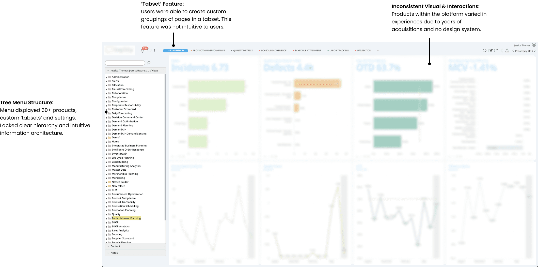
This initiative addressed user workflows, as the current platform lacked structured navigation, leading users to create custom workflows manually in 'Tabsets'.

Users need workflows that align with their daily tasks.

Navigation should be standardized to match user expectations.
Users require multi-page filtering within workflows.
The 'Tabset' feature was originally created for Sales to demo products, but became a workaround for users due to the lack of information architecture in products.

The 'Tabset' feature is not intuitive and requires training to learn.
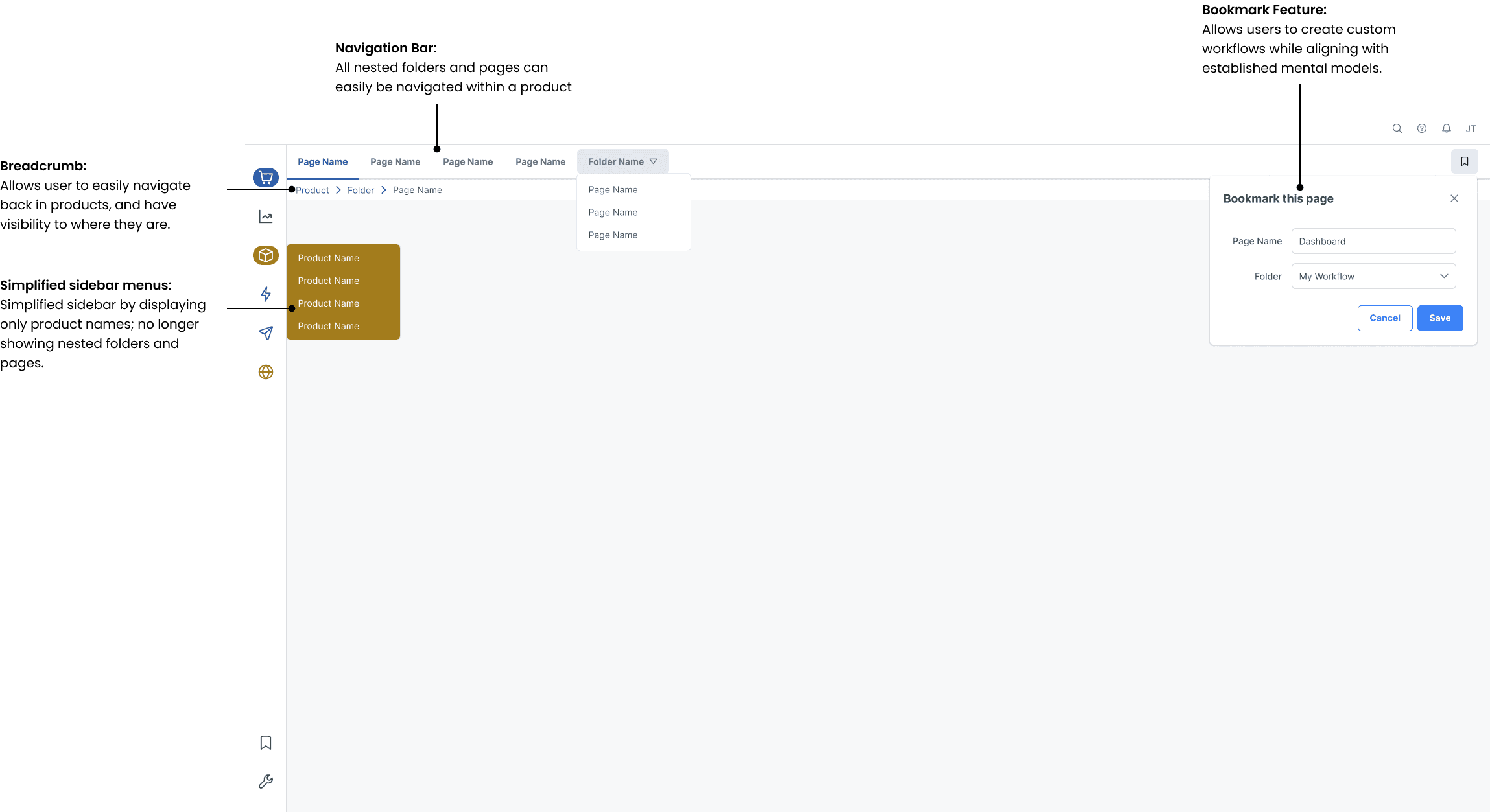
Following the changes in Initiative 2, inconsistencies in product-level information architecture became more apparent. This initiative focused on restructuring product organization to enhance usability.
Platform Level Settings:
Collaborated with the various product teams to learn more about the pages within the Administration & Configuration folders of products. Consolidated and grouped these pages into a platform level settings.

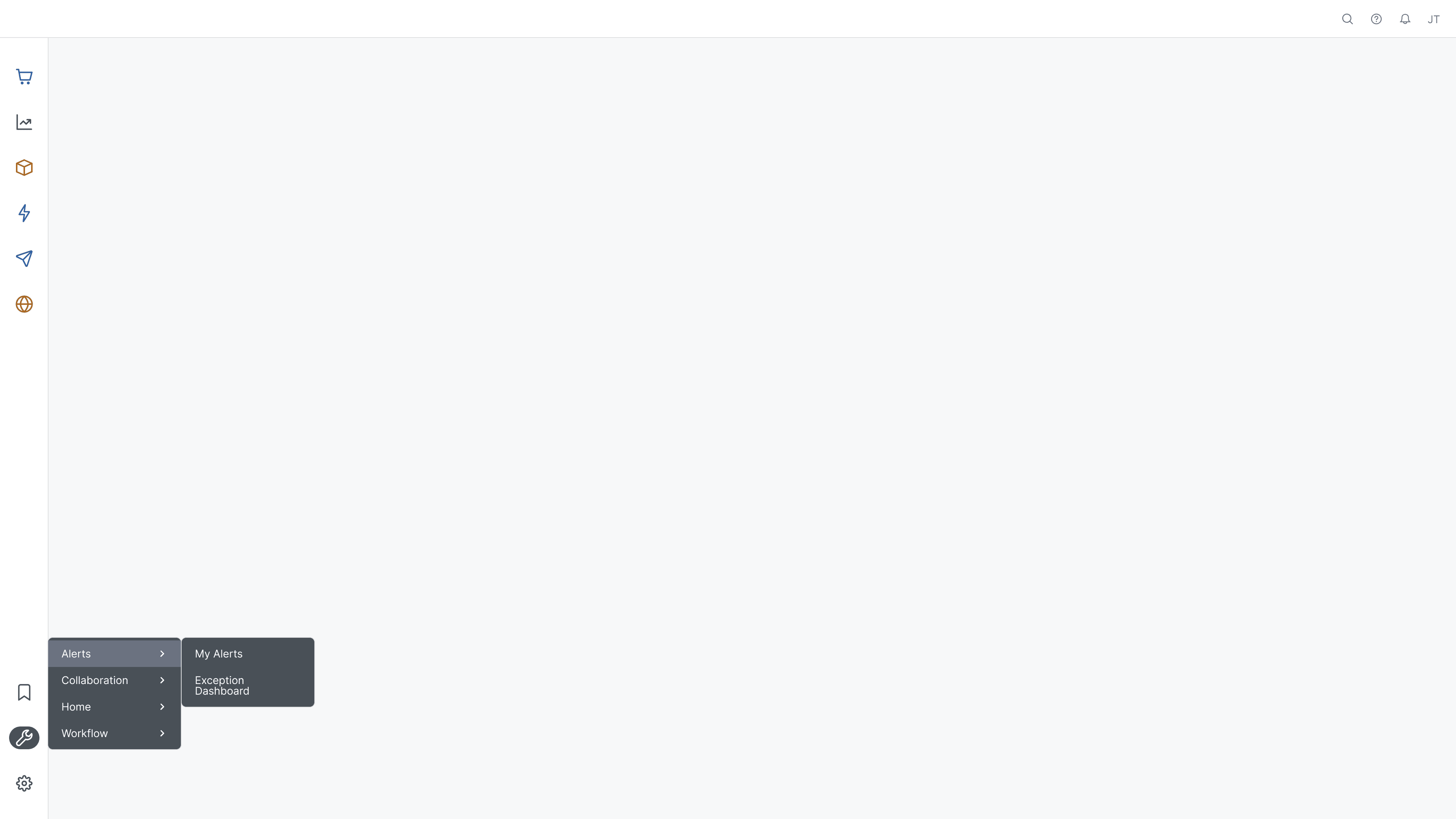
My Tools:
Provided quick access to frequently used cross-product pages, in new category: My Tools.
Improved Product Hierarchy:
Collaborated with product owners to analyze usage patterns and adjust folder structures within 35 products so they are intuitive and match user workflows. Leading to the reduction of user navigation time by 33%.
Current

Proposed

Current

Proposed


Gather user feedback to validate the effectiveness of implemented changes.
Collaborate with Product Owners to address feature duplication across products.

Continue platform refinements based on evolving business and user needs.
This project reinforced the importance of balancing business priorities with user needs, and leveraging iterative design to create a more intuitive and consistent platform experience.

B2C | Retail
Transforming the Customer Experience
Optimizing touchpoints and marketing strategies to boost customer engagement.
User Research
Competitive Analysis